Nage et Zen
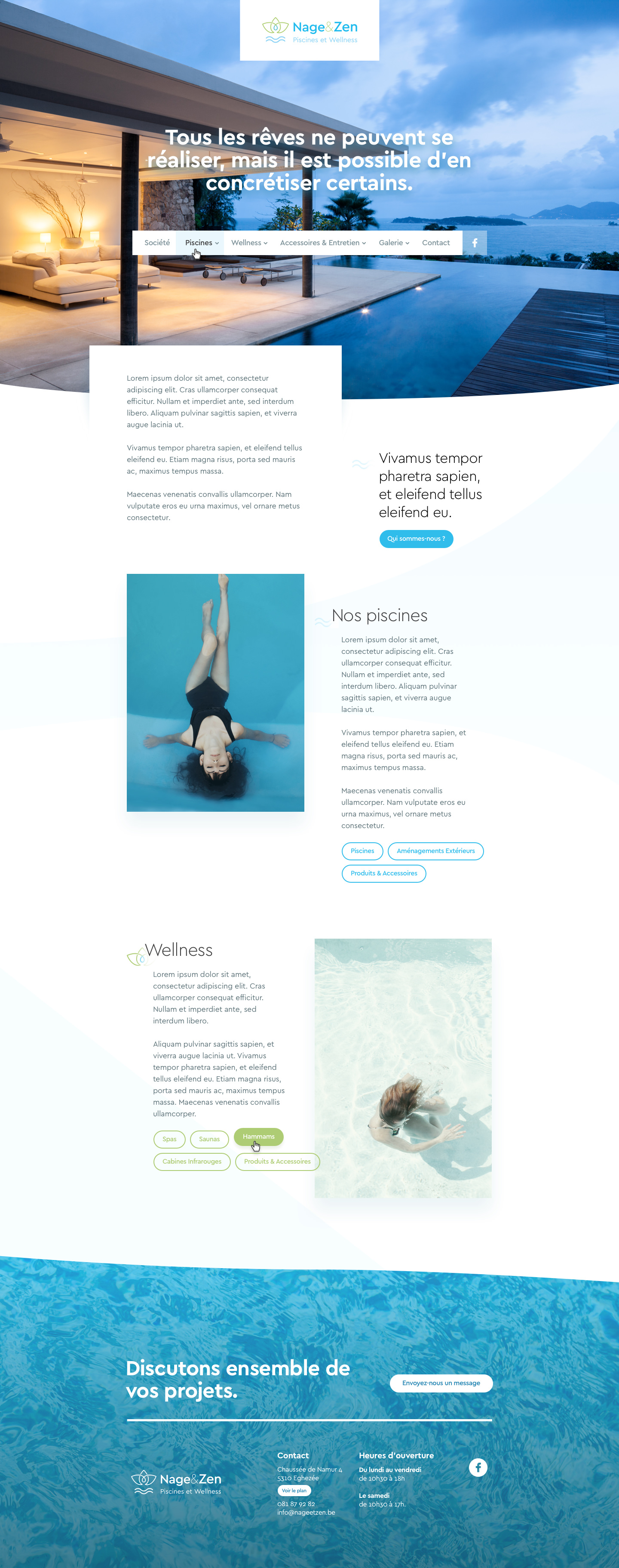
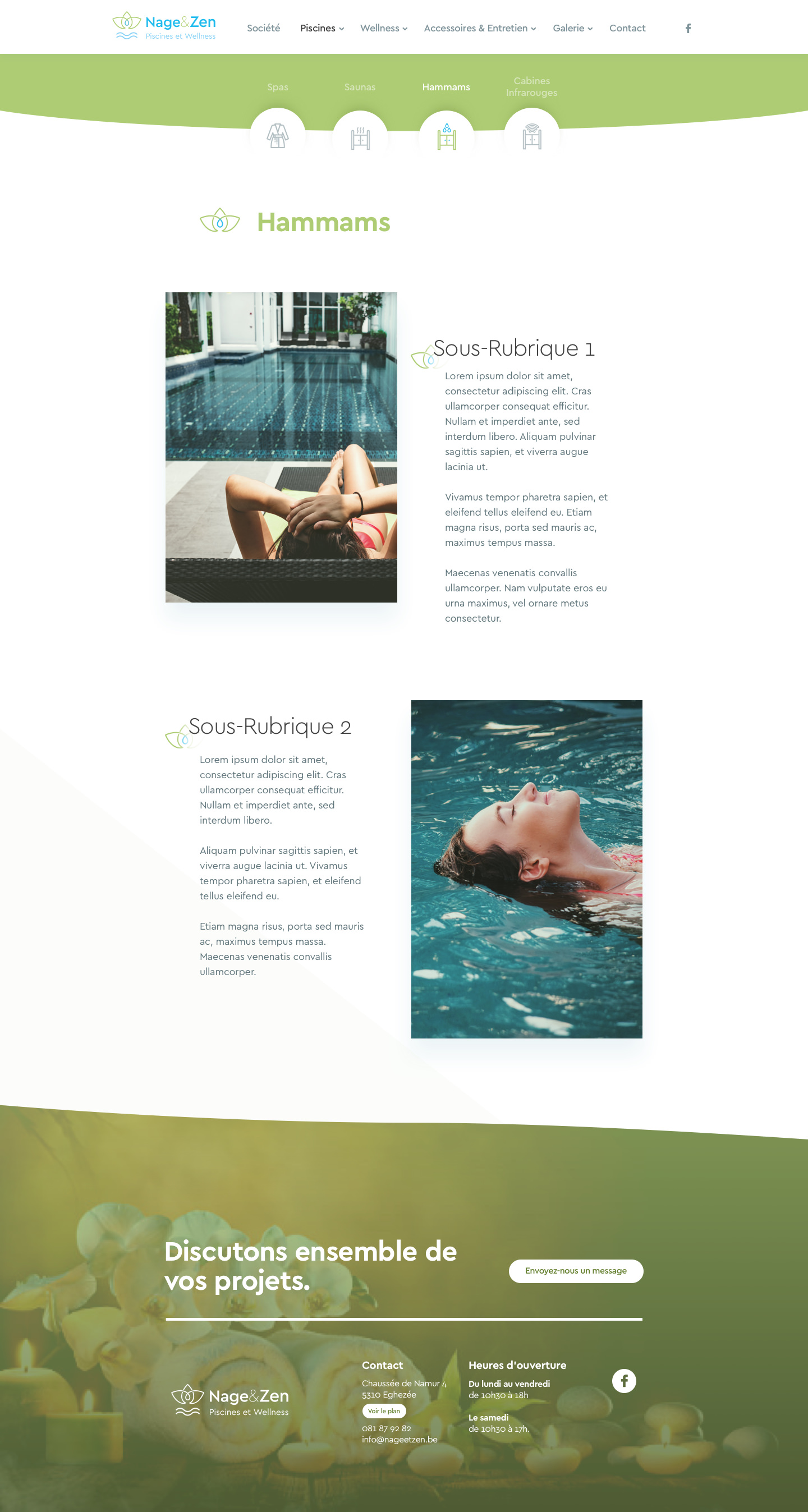
Nage & Zen’s brand new website had to be fresh and most certainly… blue. Alongside with the client we defined how content should look to be as legible as possible. I went for light and clear design and beautiful pictures with slinky depth effects.
Previous Next
